Shared Ground Brand
This thread is for discussion and decision making on the Shared Ground brand.
Overview
This brand guide seeks to be comprehensive and holistic. It seeks to reflect the aesthetic and structure of Shared Ground. It aims to be adaptable. It is written with an authoritative air but it does NOT seek to be official policy.
It is akin to a vision of how we want to appear and act in the world.
More detail and story can be found in the Brand Guide Document
Feedback
All feedback is welcome, especially looking for things that are out of alignment structurally. Additionally if there are elements that are hard to understand or are inaccessible for any other reason.
Logo
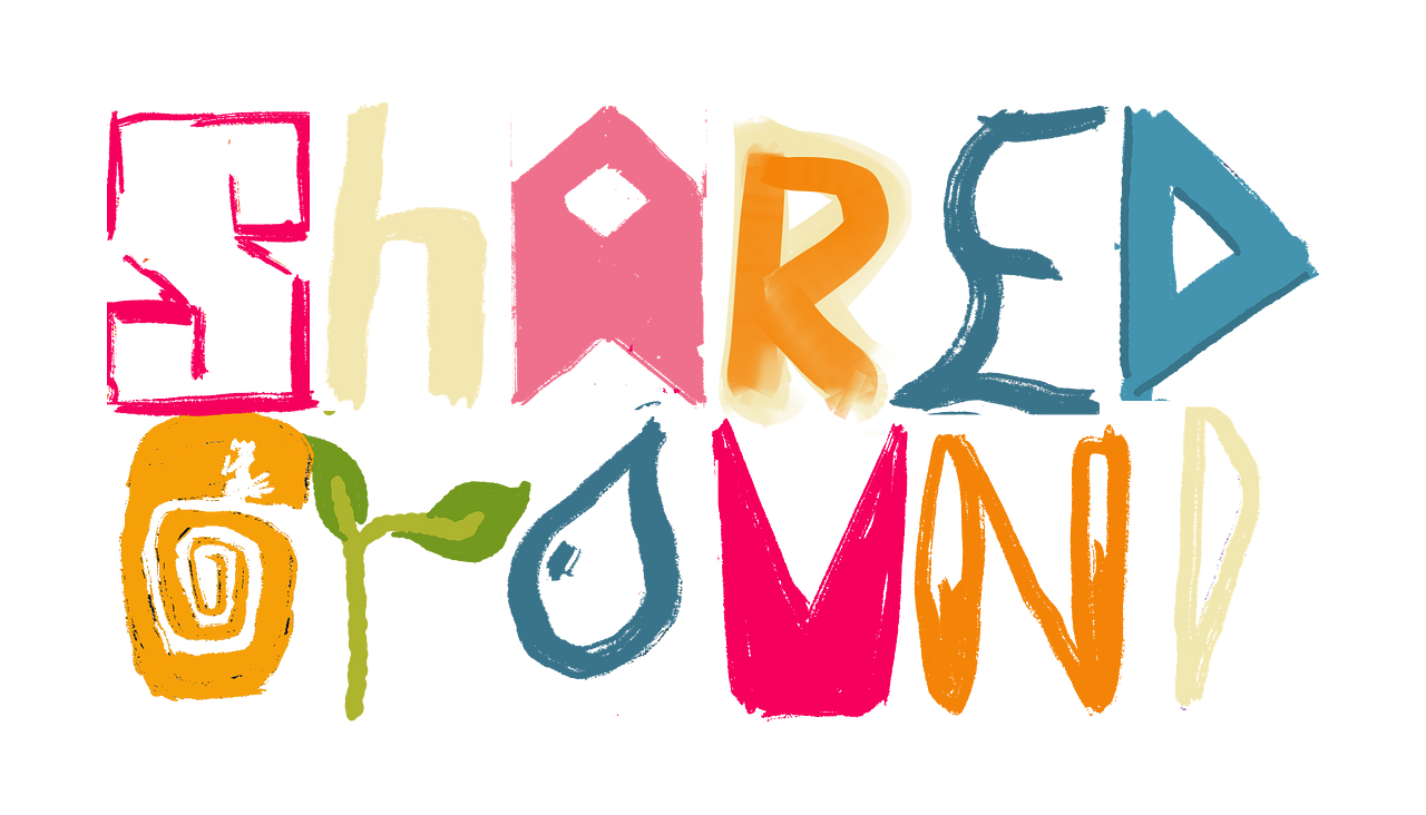
The logo is meant to be psychedelic and pluralistic. It is meant to be co-created.
Edit: As we are in the forming stage the logo exists in a sort of quantum state, all the possible futures mixing together bopping in and out of reality. As we bring more members in we can hone in on a more stable version of the logo.
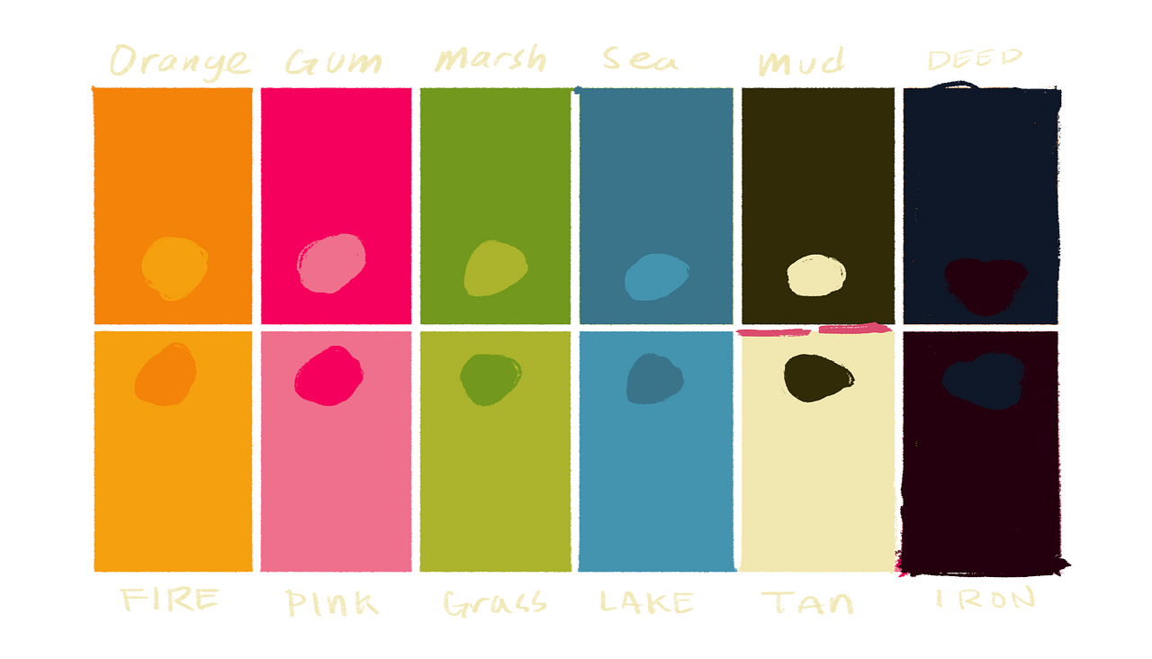
Color Pallet
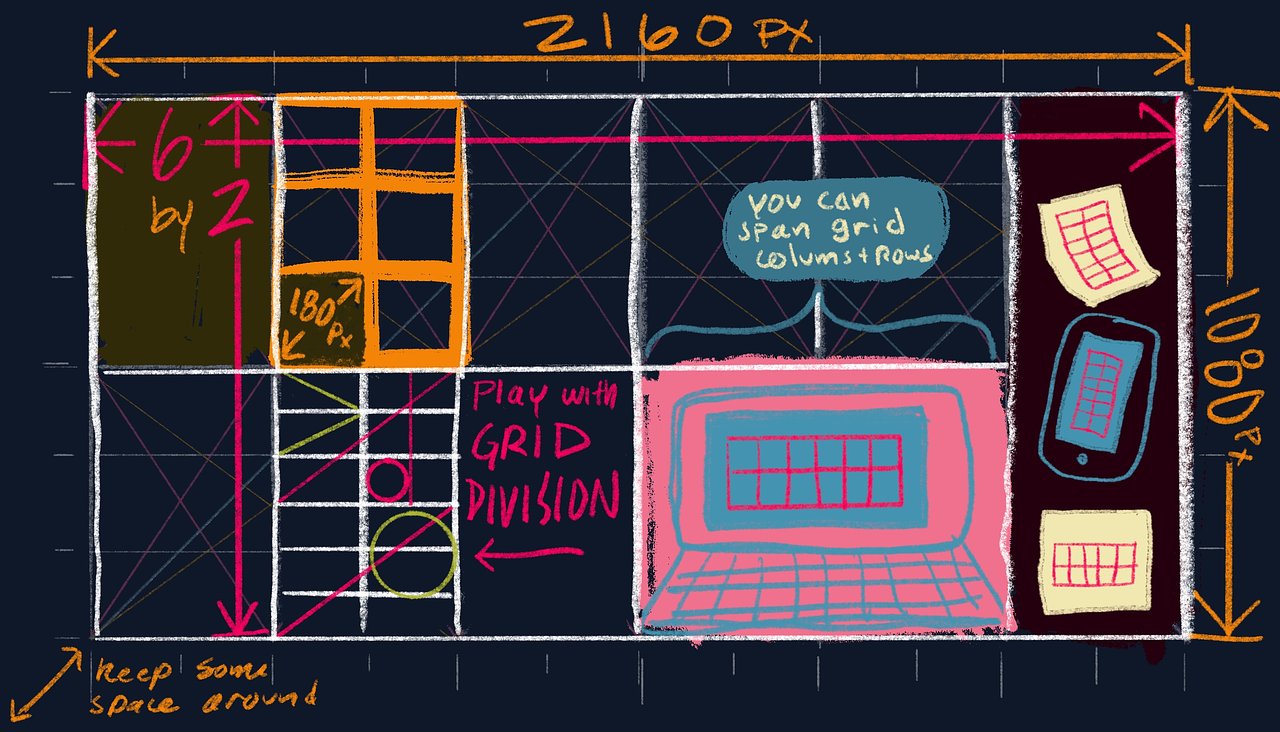
Grid
The grid is meant to help layout designs on screen and pages. More details can be found in the brand guide
Iterative Development
Rather than try and work on this until it's perfect. I propose that we check in on it at the top of every season and see how the branding is working for us.
Is this good enough to go?
proposal by Drew Hornbein Closed Fri 9 Dec 2022 5:01AM
Is the current version of the brand good enough to start using?
Results
| Results | Option | Votes | % of votes cast | % of eligible voters | |
|---|---|---|---|---|---|
| Looks good enough | 2 | 67 | 67 | ||
| Not sure yet | 1 | 33 | 33 | ||
| Concerned | 0 | 0 | 0 | ||
| Undecided | 0 | 0 |
3 of 3 votes cast (100% participation)
Adam Brock Tue 29 Nov 2022 8:53PM
Still not sold on the comic sans ;) but everything else is amazing!
Caroline Savery Tue 6 Dec 2022 6:17PM
see comment above
Drew HornbeinWed 7 Dec 2022 3:21AM
This makes a lot of sense. I see three ways to go about this.
Have the "Ground" be consistent and allow the "Shared" to be wild and chaotic
Danni suggested that we have a consistent letter shapes and allow people to change the colors
Let the logo be very permissive and open and simply create calmer versions of it for when you want to communicate that
I'm most excited about two and three.
As far as next steps, I think that we are in a chaotic place right now and that we can allow the logo to settle down as we settle down. As we move into membership I suspect that people will have lots of ideas about the brand and that the brand can really start to respond to people's needs.
The more I think about it the more I think it's ready as is, let it be a shifting mess and let the community form it into something more unified. The 12 different letters are like the quantum fluctuation of possible futures.
How I'll incorporate this feedback: I'm going to add a section about the quantum fluctuation of this early stage logo and commit to hosting some session for people to hone in on the logo as we build membership.
Caroline Savery ·Tue 6 Dec 2022 6:23PM
There is a lot to unpack in your big brand guide, some of which I do not feel comfortable with, and a lot of which I like.
Keeping it to just the boiled down brand direction presented in this vote: I like the vivid colors and pluralistic feel. I'm still struggling with whether it feels too "busy" and overstimulating, if that's a message we really want to send about who and what we are. Something about Shared Ground feels outrageously simple to me, actually. It's like going back to roots (to the wise patterns, known by our ancestors) and finding resilience there to withstand an extra-troubled, chaotic future. I'm concerned that if we present ourselves as chaotic and loud, what will be missed is that we're actually building unity through diversity, and dedicated to finding the silent, still spirit-"ground" (through good patterning) beneath a self-deluded, fraying, fragmenting society. If the "shared" part is deliberately diverse and open-ended, the "ground" part feels important and I don't want that ground part to be missed in our brand.
Are we creating a community and space that people can feel as sanctuary, can feel "at home" at, to be their true selves and find their most meaningful work? That feels like solid ground in this windy world. And ground does not feel like 12 different letter styles (fonts and colors) in a single logo. That feels too stimulating for me to be able to relax into. <-- I'm just trying to "get at" what my aesthetic concerns are with this illustration. But words are blegh! Hope this is making any sense.